


Why Are Some Climate Scientists Changing the Facts to Alarm Us?

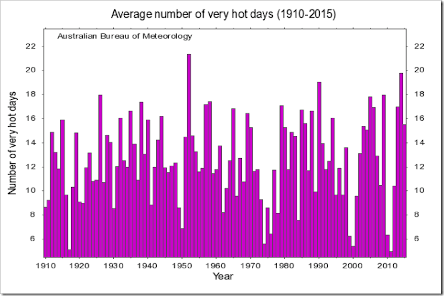
Jo Nova put out an excellent post yesterday that deserves to be read in its entirety, but the most striking part of her story to me consisted of two charts put out by the same Australian agency a few years apart. The agency is the Bureau of Meteorology (BOM) and the first chart is this one, put out in 2016 or so:
And, here is the second chart from BOM, which takes things up to 2024:
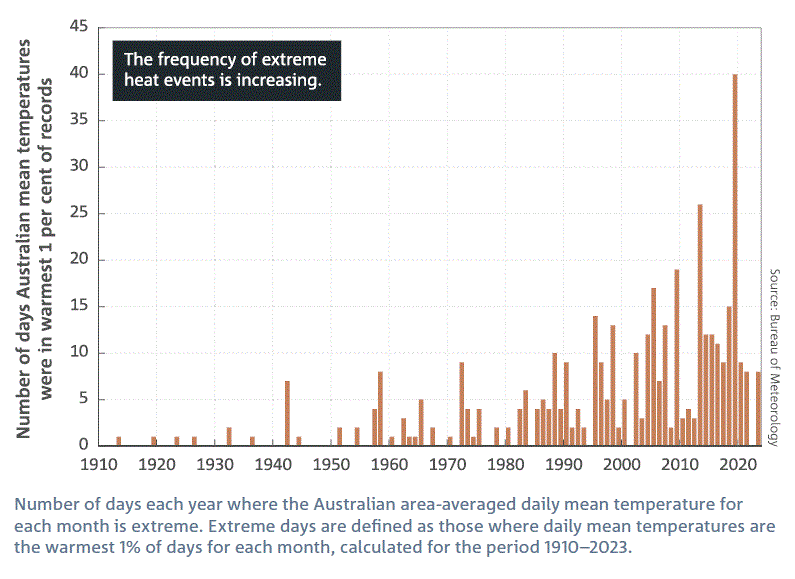
How does one reconcile these two charts? There's only one answer. It's a case of manipulation by the BOM and the Commonwealth Scientific and Industrial Research Organisation (CSIRO). Jo Nova explains:
The BOM and CSIRO … don’t tell Australians that they keep adjusting the data, even a hundred years after it happened. Some poor towns didn’t know they were two degrees colder in World War I until the BOM “discovered” that in 2014. The people of Marble Bar thought they had the hottest heatwave in world history in 1923 until the BOM traveled back in time to delete it, I mean “correct it.” Temperatures in 1910 have fallen 22 degrees Fahrenheit in the last 10 years.
This isn't just happening in Australia, of course. It's taking place here, too, and, undoubtedly, across the West in support of the Big Green Grift. Statistics are being adjusted on an ongoing basis to support the climate crisis narrative. And, mainstream media types are more interested in serving as sycophants than questioning the stats. This is the sad status of climate science today; facts are being changed to fit a desired narrative and that's not science.
#Australia #Temperature #BOM #CSIRO #ClimateScience #JoNova

David Wojick writes this:
"This is hilarious! What the charts show is that while there has been a good bit of warming NONE has occurred in hot weather. Pat Michaels used to say that most of the warming was in winter, which is good, and this supports that although it could also be in spring and fall. So no heat emergency.
The two heat charts are showing two entirely different things so no adjustment is involved. The “extreme heat events” chart merely shows it is warming so is mistitled to be scary. Nothing hot about those bars. They include warm winters. The “very hot days” chart shows no increase."
This should not be a surprise. Anything to push the narrative!